Some places were never meant to be modest. They were planned as statements, built to organize attention, and polished so visitors would understand the message before anyone said a word.
From Gilded Age mansions to civic monuments and transportation palaces, these destinations reveal how architecture has long been used to project power, culture, wealth, and national confidence. Keep reading, and you will see how design choices from the 1890s to the present still shape the way people remember arrival, prestige, and public spectacle in America.
1. The Biltmore Estate
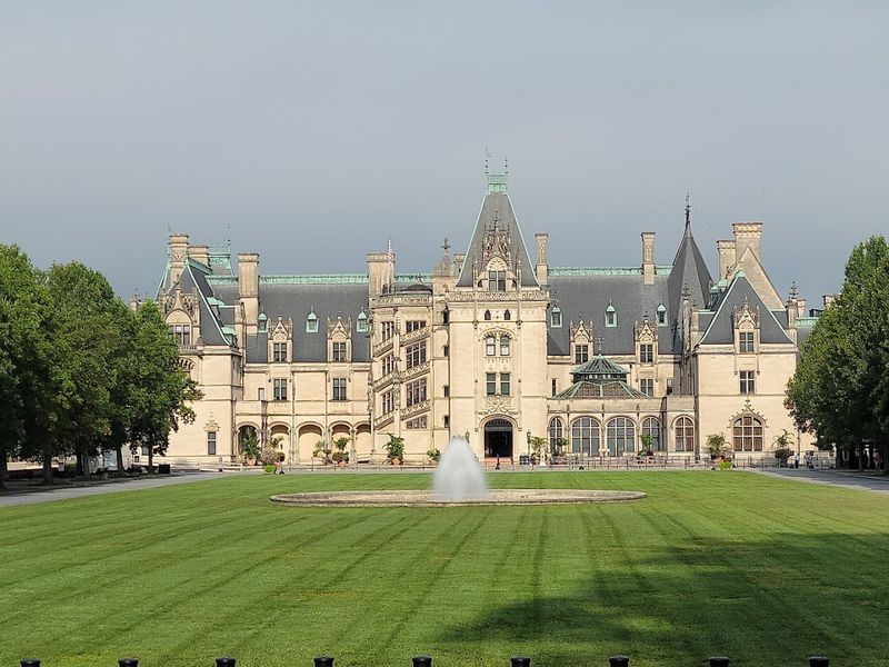
Nothing says “please be impressed” quite like a 250-room house in the Blue Ridge Mountains. George Vanderbilt opened Biltmore in 1895 after years of planning with architect Richard Morris Hunt and landscape designer Frederick Law Olmsted, creating an estate meant to reflect learning, wealth, and cultivated taste.
The mansion borrowed heavily from French chateau design, but it also functioned as a modern country home with elevators, electric lighting, and advanced plumbing. Guests moved through banquet halls, libraries, winter gardens, and long corridors that turned hospitality into a carefully staged performance.
Biltmore was not just large. It was strategic.
The estate signaled that American fortunes of the Gilded Age could rival old European aristocracy, while its gardens, forestry program, and later vineyard added another layer of polished ambition that still works on visitors today.
2. Grand Central Terminal
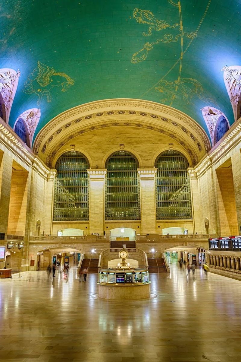
Few train stations have ever entered a room before you do, but Grand Central manages it. Completed in 1913 by Reed and Stem with Warren and Wetmore, the terminal replaced an older depot and transformed rail travel into a civic spectacle wrapped in Beaux-Arts confidence.
The main concourse was engineered for drama and order at once, with a vast ceiling mural, tall arched windows, marble surfaces, and circulation patterns that kept crowds moving with surprising grace. Even the information booth became iconic, which is not something most buildings can claim without sounding smug.
Grand Central also reflected a changing New York. Electrified tracks made the complex cleaner and more modern than steam-era stations, while the surrounding Terminal City development tied transportation to commerce, prestige, and urban growth.
It still turns an ordinary commute into an event with excellent posture.
3. The Palace of Fine Arts
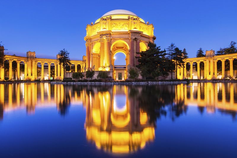
Some buildings were created for utility, and some were built because delight itself needed a blueprint. The Palace of Fine Arts appeared at the 1915 Panama-Pacific International Exposition in San Francisco, where architect Bernard Maybeck designed a classical fantasy that looked intentionally ancient and emotionally oversized.
Maybeck rejected straightforward fair architecture and instead created a rotunda, colonnades, and lagoon setting inspired by Roman ruins and Beaux-Arts theatricality. Visitors were meant to pause, wander, and feel that art deserved its own ceremonial environment rather than a plain exhibition hall.
The original structure used temporary materials, which sounds almost mischievous given how beloved it became. Public affection kept the site alive, and a reconstruction in the 1960s preserved its role as one of America’s clearest examples of architecture designed less to house a function than to create a reaction.
It still succeeds with suspicious ease.
4. The Breakers
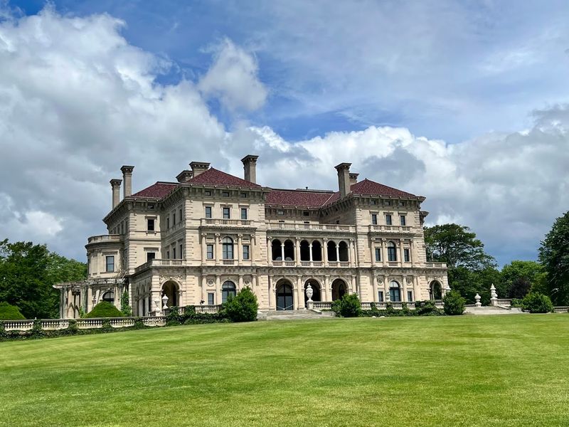
If subtlety had been invited to Newport, it definitely did not stay at The Breakers. Cornelius Vanderbilt II commissioned the mansion after a fire destroyed an earlier home, and architect Richard Morris Hunt completed the new house in 1895 as a summer residence with palace-level ambition.
Its design drew from Italian Renaissance models, using marble, gilded ornament, painted ceilings, and an imposing central hall to communicate status before guests had time to adjust their collars. This was seasonal living upgraded into a public declaration that American industrial money could master European decorative language.
The Breakers also reflected Newport’s role as a social proving ground during the Gilded Age, when elite families competed through architecture as much as conversation. Built with steel trusses and modern systems behind its historic styling, it balanced showmanship with practicality.
Today, visitors still read it correctly: this was a house, yes, but never merely a house.
5. The Gateway Arch
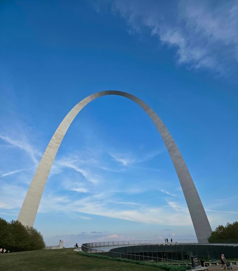
A curve this clean tends to stop conversations for a second. The Gateway Arch, completed in 1965 and designed by Eero Saarinen, rose on the St. Louis riverfront as the centerpiece of the Jefferson National Expansion Memorial, linking modern design to the older national story of westward movement.
At 630 feet, the stainless steel monument is both sculpture and engineering feat, shaped as a weighted catenary arch with a visual simplicity that hides significant structural complexity. Saarinen avoided decorative clutter, trusting scale, proportion, and reflective material to do the work.
That restraint is exactly why it lands so effectively. Visitors encounter a monument that feels futuristic even though it commemorates nineteenth-century expansion, and the contrast gives it unusual staying power.
The tram ride to the top adds a little space-age flair, but the main event remains the silhouette itself, which may be America’s most disciplined attempt to look effortlessly monumental.
6. Hearst Castle
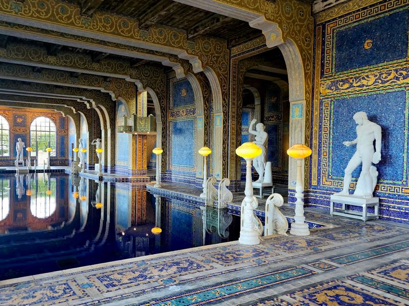
When a newspaper titan builds a hilltop retreat, understatement usually packs its bags early. Hearst Castle developed over decades beginning in 1919, when William Randolph Hearst worked with architect Julia Morgan to create an estate that mixed Mediterranean revival architecture with an encyclopedic appetite for art and display.
The complex included guest houses, formal pools, terraces, gardens, and rooms filled with European ceilings, tapestries, sculpture, and architectural fragments collected across continents. Morgan had the difficult assignment of turning a collector’s grand ambitions into a coherent place, and somehow she managed it with remarkable discipline.
Guests arrived not just for hospitality but for a curated environment that signaled intellect, reach, and expense in equal measure. The estate’s famous Neptune Pool and indoor Roman Pool often get the headlines, yet the larger effect comes from the total composition.
Hearst Castle operates like a master class in persuasive excess, edited by someone who knew exactly when to stop.
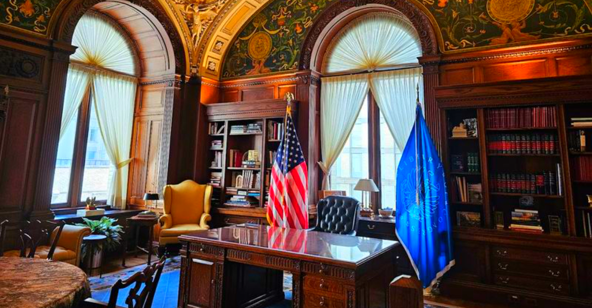
7. The Library of Congress
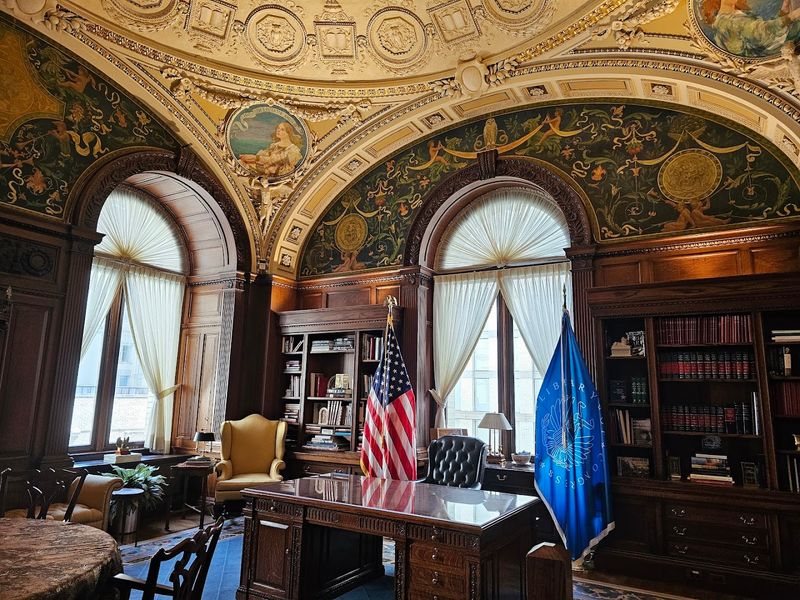
Libraries rarely try to outdress palaces, yet this one clearly understood the assignment. The Thomas Jefferson Building of the Library of Congress opened in 1897 and announced, through murals, mosaics, sculpture, and marble staircases, that the United States intended to house knowledge with unmistakable grandeur.
Designed by John L. Smithmeyer and Paul J.
Pelz, with major interior work shaped by many artists and craftsmen, the building followed Beaux-Arts principles while celebrating literature, science, law, and history across nearly every visible surface. It is decorative, but never random.
The iconography was chosen to teach as much as to impress.
The project emerged during a period when Washington was defining its civic image with increasing confidence. Rather than hiding scholarship behind plain walls, the building made learning feel public, ceremonial, and worth funding at a lavish scale.
Visitors still respond to that message quickly: ideas matter, and here they get a staircase worthy of the introduction.
8. Union Station
Train stations once doubled as national handshakes, and Union Station offered a very firm one. Opened in 1907 in Washington, D.C., and designed by Daniel Burnham, the terminal was conceived as a ceremonial gateway that matched the capital’s monumental planning and City Beautiful ideals.
Its great hall, triumphal arches, classical detailing, and long spatial axes were meant to orient travelers and elevate their expectations before they saw a single government building. Burnham treated arrival as civic theater, giving rail passengers a sequence of spaces that suggested order, authority, and polished national purpose.
The station also solved practical problems by consolidating rail lines and reducing grade crossings, which made it more than an attractive shell. Still, function alone does not explain its hold on memory.
Union Station made transportation feel official in the best possible way, like the country had straightened its tie and come to the platform to greet you personally.
9. The Bellagio Fountains
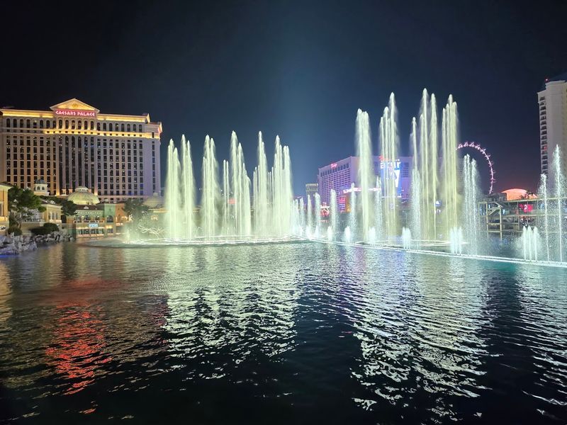
Las Vegas does not exactly whisper, and the Bellagio fountains never considered starting. Debuting with the resort in 1998, the lakefront show was designed by WET to transform a prime Strip frontage into public spectacle, using coordinated water movement as an attraction visible even before visitors walked inside.
The system combines thousands of nozzles, lights, and powerful shooters that send water high above the lake in routines timed to music. What makes it historically interesting is not just scale, but placement.
A luxury hotel devoted some of its most valuable real estate to a free performance built purely to create memory and foot traffic.
That choice says a lot about late twentieth-century entertainment architecture. The Bellagio fountains turned the hotel exterior into a repeating event, one that helped redefine how resorts marketed themselves in an era of themed environments and branded experience.
You are not just passing by. You are being given a preview of the sales pitch, and it is unusually well rehearsed.
10. The Getty Center
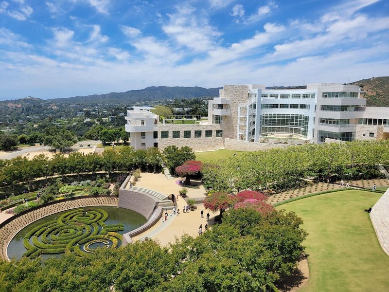
Before you reach the galleries, the Getty Center has already started making its case. Opened in 1997 and designed by Richard Meier, the hilltop complex uses arrival as part of the experience, beginning with a tram ride and continuing through plazas, terraces, gardens, and carefully framed views of Los Angeles.
Meier’s design relies on travertine stone, white metal panels, geometric order, and an unusually deliberate relationship between architecture and landscape. The site feels precise without becoming stiff.
Even circulation routes are part of the performance, guiding visitors through changing elevations and sightlines before they encounter the art itself.
This approach reflects a late twentieth-century museum trend in which the building became a destination equal to the collection. The Getty Center also signaled institutional confidence, presenting philanthropy, scholarship, and architecture as a single public package.
It is the rare cultural campus that makes you notice how you are moving, where you are standing, and exactly why someone wanted that moment to matter.
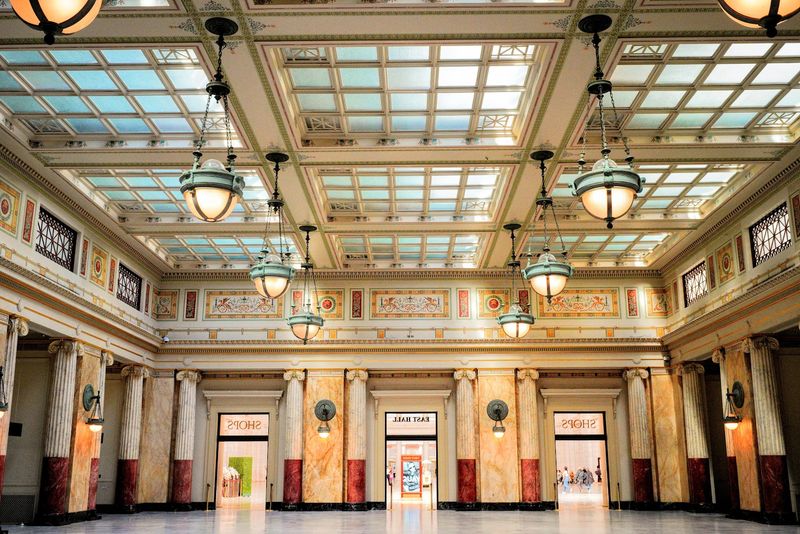
11. The Chicago Cultural Center
Civic pride put on formalwear when this building opened in 1897. The Chicago Cultural Center began as the city’s first central public library and a memorial hall for Grand Army veterans, but its mosaics, marble, bronze, and stained glass made it look far grander than most people expect from municipal architecture.
The building is especially famous for its Tiffany glass domes, including the massive dome over Preston Bradley Hall, which still gives visitors a reason to stop mid-sentence. Architects Shepley, Rutan and Coolidge designed the structure in an opulent Beaux-Arts style that aligned cultural access with public dignity.
That ambition mattered in a city rebuilding its image after the nineteenth century’s upheavals and rapid growth. Rather than reserving ornament for private mansions, Chicago invested in a public interior that suggested education and civic life deserved beauty too.
It remains one of those places that politely reminds you a city hall-adjacent building can still outperform plenty of luxury hotels.
12. The Chrysler Building
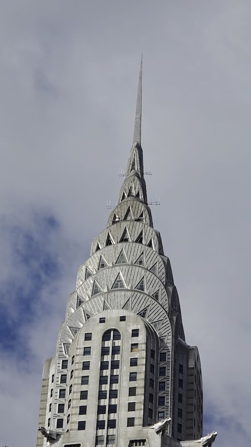
Skyscraper competition rarely produces modest results, and the Chrysler Building arrived determined to win. Completed in 1930 for automobile executive Walter P.
Chrysler and designed by William Van Alen, the tower briefly became the tallest building in the world through a famous secret spire maneuver that delighted headline writers.
Its Art Deco design turned modern industry into ornament, using stainless steel arches, triangular windows, stylized hubcaps, and eagle-like gargoyles inspired by Chrysler car details. The building was commercial real estate, certainly, but it also functioned as a giant advertisement for speed, innovation, and metropolitan confidence.
The timing is important. Rising at the end of the 1920s, it captured the era’s fascination with machines, vertical growth, and corporate identity just before economic realities shifted the national mood.
Even now, the crown feels less like decoration than a public announcement. It tells the skyline that ambition has arrived, dressed sharply, and fully intends to be noticed.
13. The Venetian Resort
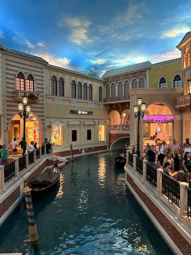
Only Las Vegas would answer a travel fantasy with indoor canals and a straight face. The Venetian Resort opened in 1999 on the Strip, replacing the Sands and embracing the late twentieth-century casino trend of immersive theming on a scale large enough to make irony seem unnecessary.
Its design borrows recognizable elements from Venice, including campanile references, bridges, piazza-style spaces, and gondola rides, then filters them through resort economics and climate-controlled convenience. The result is not a historical reconstruction.
It is a theatrical translation built to keep guests circulating, entertained, and pleasantly disoriented.
That makes the resort a revealing cultural artifact. It reflects a period when American leisure spaces increasingly packaged famous places as consumable experiences, blending shopping, gaming, dining, and architecture into one uninterrupted sales environment.
Yet the craftsmanship and sheer confidence still make an impression. The Venetian knows exactly what it is doing, and the ceiling is absolutely in on the joke.
14. The United States Capitol
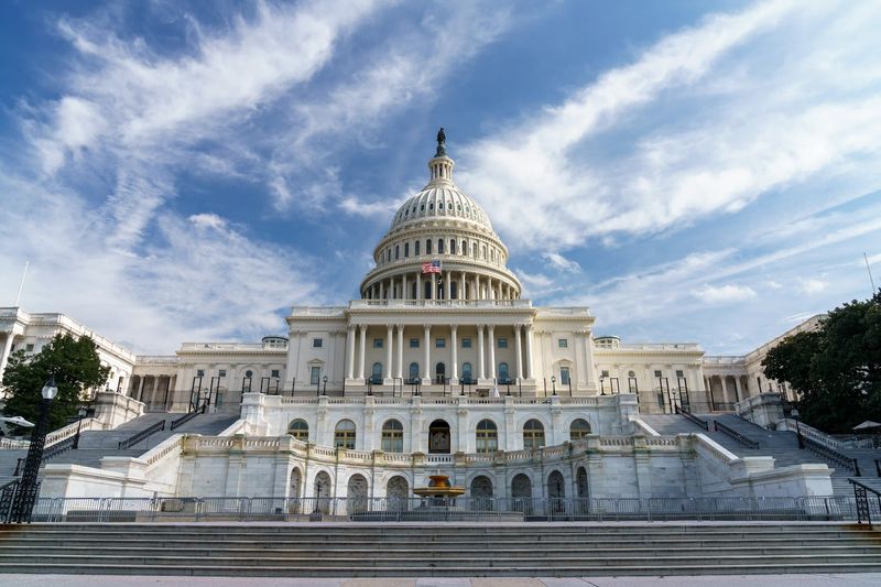
Power likes a dome, and the Capitol wears one with remarkable confidence. Begun in the 1790s and expanded repeatedly through the nineteenth century, the United States Capitol was designed to communicate republican stability through neoclassical architecture drawn from ancient Rome and Enlightenment ideals.
The building’s long evolution matters. Early designs by William Thornton set the tone, while later work by Benjamin Henry Latrobe, Charles Bulfinch, and Thomas U.
Walter shaped the wings and the cast-iron dome that now defines the skyline. Grand stairs, ceremonial rooms, and axial planning turned legislation into visible national ritual.
Visitors experience the Capitol not only as a workplace but as a symbol engineered to carry institutional meaning. It had to look durable, orderly, and larger than any single administration.
That is why its spaces feel intentionally formal rather than merely decorative. The building presents government as something organized, permanent, and composed, which is a very ambitious visual promise and quite an effective one.
15. Balboa Park
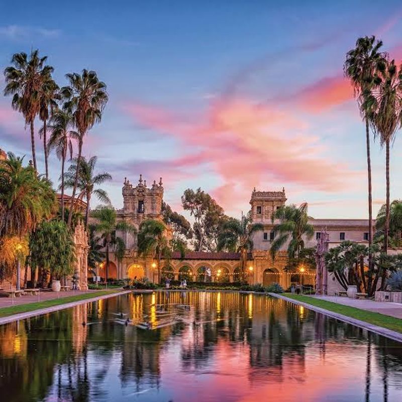
San Diego decided to throw a party in 1915 and accidentally built one of America’s most memorable urban showplaces. Balboa Park emerged from the Panama-California Exposition, where planners and architect Bertram Goodhue used Spanish Colonial Revival architecture to give the city a distinctive visual identity tied to regional history.
Arcades, towers, courtyards, ornamented facades, and formal landscaping created a campus that felt both ceremonial and stroll-friendly, which is harder than it looks. Rather than presenting temporary fair buildings as disposable backdrops, the exposition framed architecture itself as a major attraction and a tool for civic branding.
The park’s long afterlife shows how effective that strategy was. Museums, gardens, and cultural institutions eventually filled the grounds, but the original goal of impressing visitors never disappeared.
Balboa Park still demonstrates how exposition architecture could shape a city’s image for generations. It is part public park, part design statement, and entirely aware that first impressions can have a very long career.
16. The Griffith Observatory
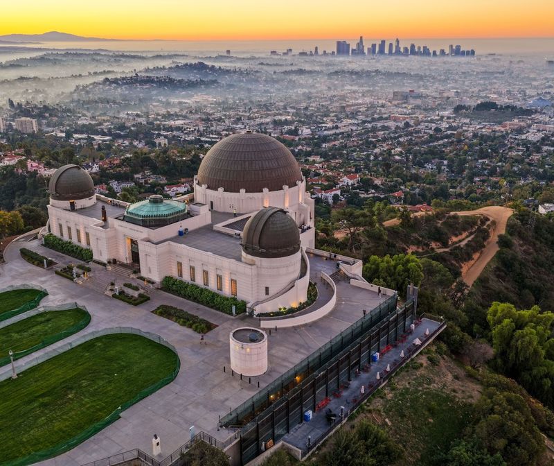
Science got a Hollywood entrance when Griffith Observatory opened in 1935. Funded through the bequest of Griffith J.
Griffith and designed by John C. Austin and Frederick M.
Ashley, the hilltop building combined public education with striking siting, making astronomy feel accessible without sacrificing ceremony.
Its Art Deco and Greek Revival touches, broad terraces, and commanding views over Los Angeles turned the observatory into both a civic landmark and an invitation to look outward. This mattered because the institution was built for the public, not reserved for specialists.
Telescopes, exhibits, and planetarium programming were meant to democratize scientific curiosity.
The location did half the rhetorical work. By linking city panorama with skyward observation, the observatory connected urban growth, modern technology, and cosmic scale in one visit.
It also became deeply embedded in popular culture, which only reinforced its role as a place of arrival and perspective. Few educational buildings have sold the idea of learning with such practiced visual confidence.
17. The Plaza Hotel
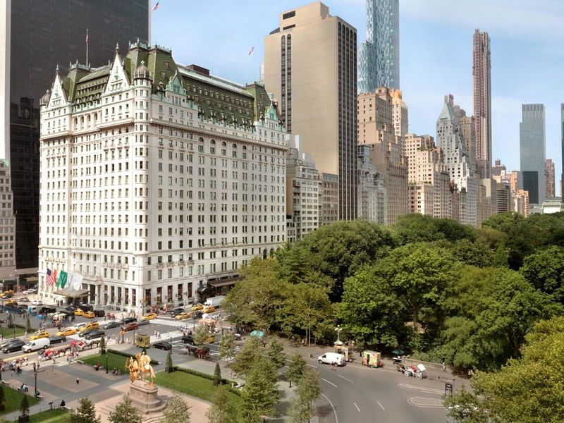
Hotels are in the business of first impressions, and the Plaza has treated that job as a high art. Opening in 1907 at Fifth Avenue and Central Park South, the hotel was designed by Henry Janeway Hardenbergh to project metropolitan luxury at a moment when New York hospitality was becoming increasingly theatrical and competitive.
Its French Renaissance-inspired exterior, richly appointed interiors, and prestigious address created a complete social signal. Guests were not just booking a room.
They were entering a setting associated with elite travel, public ceremony, and the kind of polished service that made even brief stays feel socially legible.
The Plaza also benefited from timing. Early twentieth-century New York was consolidating its status as a global city, and landmark hotels became part of that identity, hosting visitors who expected architecture to reinforce importance.
Over time, the building moved from luxury address to cultural symbol through films, fiction, and public fascination. It remains a place where decorum and display still shake hands in the lobby.
18. The Hoover Dam
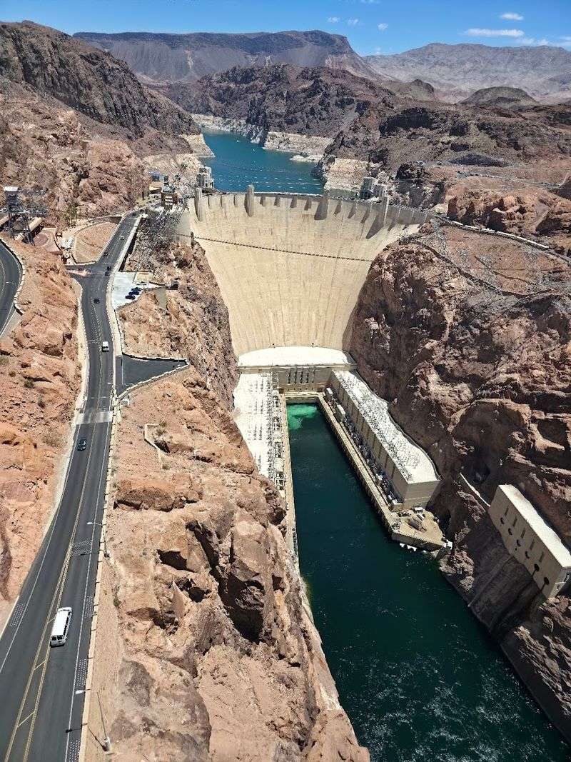
Concrete rarely gets described as charismatic, yet Hoover Dam makes a strong case for the exception. Completed in 1936 during the Great Depression, the dam rose in Black Canyon on the Colorado River as a federal engineering project designed for flood control, hydroelectric power, and a very visible display of national capability.
Its scale alone impresses, but the design goes further. Art Deco styling, streamlined forms, sculptural ornament, and carefully composed viewpoints gave the structure a civic dignity unusual for infrastructure.
Engineers and designers understood that the dam would attract visitors, so utility and presentation were planned together rather than treated as separate concerns.
That decision helped turn the project into a public icon. Hoover Dam represented modern construction, labor organization, and government ambition in material form, all while supplying power and water to a rapidly developing region.
It still feels persuasive because it never hides what it is. Function stands front and center, dressed with just enough ceremony to look unforgettable.