They sold us snacks, sodas, and fast food with catchy lines and unforgettable faces. Then, almost overnight, they were gone. From culture-shifting reckonings to marketing pivots and headline-grabbing controversies, these mascots vanished without warning and left curious gaps in pop culture. Dive in to uncover why these icons were retired, how brands reinvented themselves, and what their departures reveal about changing times.
1. Joe Camel (Camel Cigarettes)
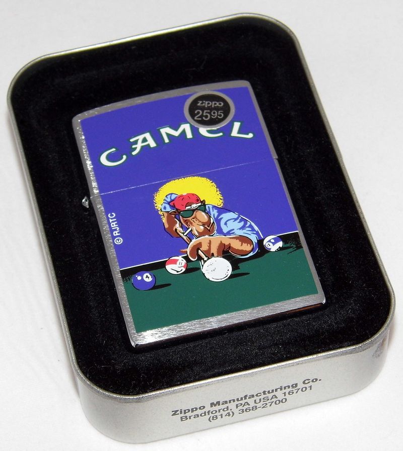
Joe Camel strutted across late eighties and nineties ads like a lounge-lizard icon, all sunglasses, smirk, and swagger. He symbolized a rebellious cool that cigarette marketing had honed for decades and became instantly recognizable. Critics argued his cartoon edge appealed to minors, sparking studies, hearings, and public outcry. Despite soaring brand awareness, the climate turned. By 1997, Joe was retired as regulators and watchdogs sharpened focus on youth marketing. His exit marked a turning point in tobacco advertising and corporate scrutiny. Today, Joe Camel remains a case study in how cultural norms and public health pressures can abruptly end powerful campaigns.
2. Aunt Jemima (Quaker Oats / Pancake Syrup)
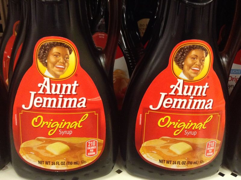
Aunt Jemima long embodied a brand built on problematic imagery rooted in racial stereotypes. For generations, the smiling figure appeared on boxes and bottles, shaping breakfast tables and cultural memory. As public conversations about representation intensified, her image became untenable. In 2020, the company retired Aunt Jemima and reintroduced the line as Pearl Milling Company. The shift arrived amid broader corporate rebranding and accountability movements. Supporters welcomed the change as overdue, while skeptics debated the pace of progress. Regardless, it signaled a significant reset in mainstream marketing. The brand now foregrounds product heritage without the caricatured figure.
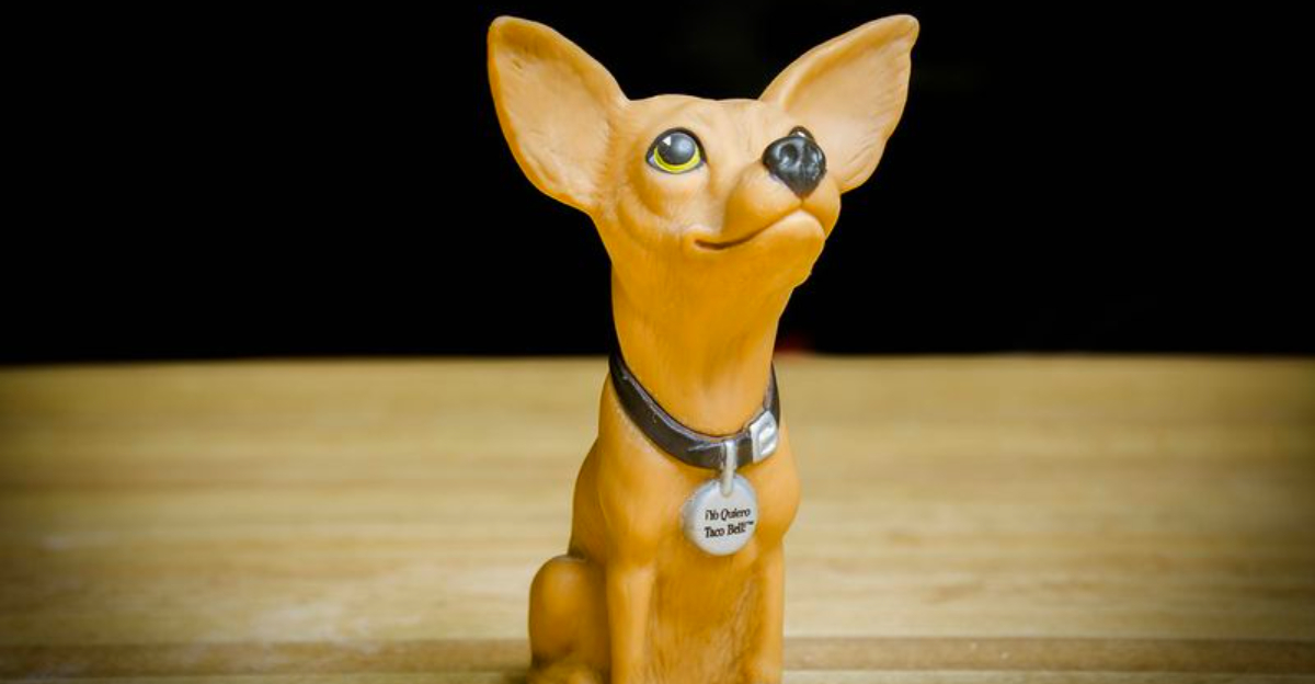
3. The Taco Bell Chihuahua (Gidget)
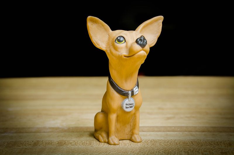
The Taco Bell Chihuahua exploded into pop culture with the catchphrase Yo quiero Taco Bell, spawning toys, T-shirts, and endless parodies. During the late nineties, the tiny dog overshadowed the food, for better and worse. Critics questioned cultural stereotyping and the campaign’s effectiveness in boosting sales. As marketing priorities shifted around 2000, the chihuahua quietly exited the stage. Gidget, the canine actor, found renewed fame in other roles, but the mascot’s run was over. Taco Bell pivoted toward product-focused ads and bold, stunt-like promotions. The chihuahua remains a nostalgic artifact of fast-food advertising’s quirky, meme-ready era.
4. The Noid (Domino’s Pizza)
The Noid, a rubbery claymation saboteur, personified delivery disasters that Domino’s promised to avoid. Zany, frenetic, and unmistakably eighties, he became a cult favorite with video games and merchandise. But the character collided with a tragic real-life incident that complicated brand associations. By the early nineties, Domino’s pulled the plug as its messaging matured. The Noid’s disappearance reflected a broader shift away from cartoon villains toward quality and speed. Decades later, brief revivals tapped nostalgia carefully. Still, the original run’s sudden end illustrates how unpredictable events and evolving tastes can derail even wildly recognizable mascots.
5. Spuds MacKenzie (Bud Light)

Spuds MacKenzie, the hard-partying bull terrier, embodied late eighties nightlife fantasy with sunglasses, beach scenes, and neon. The campaign generated huge buzz but quickly raised concerns about alcohol marketing’s appeal to younger audiences. Public pressure and regulatory attention followed. Despite brand lift, controversy outpaced the benefits. By 1989, Spuds was retired, a cautionary tale about glamorizing drinks through mascot charm. The character’s cultural footprint endures in parodies and retrospectives. Spuds helped define an era of attention-grabbing beer ads, but shifting standards ended the fun. Brands learned to balance spectacle with responsibility to avoid backlash and regulatory heat.
6. Uncle Ben (Ben’s Original Rice)
For decades, Uncle Ben’s packaging featured a dignified older Black man whose origins echoed outdated servitude imagery. As conversations about racial justice surged, the company reassessed the character’s implications. In 2020, the brand relaunched as Ben’s Original, dropping both honorific and portrait. The change spurred debate over symbolism versus substantive action but undeniably reshaped the shelf presence. New packaging highlights quality and community initiatives instead of a caricatured figurehead. It marked a wider industry trend toward culturally sensitive branding. Uncle Ben’s retirement stands as a prominent example of corporate course correction in response to evolving consumer expectations.
7. Cream of Wheat Chef
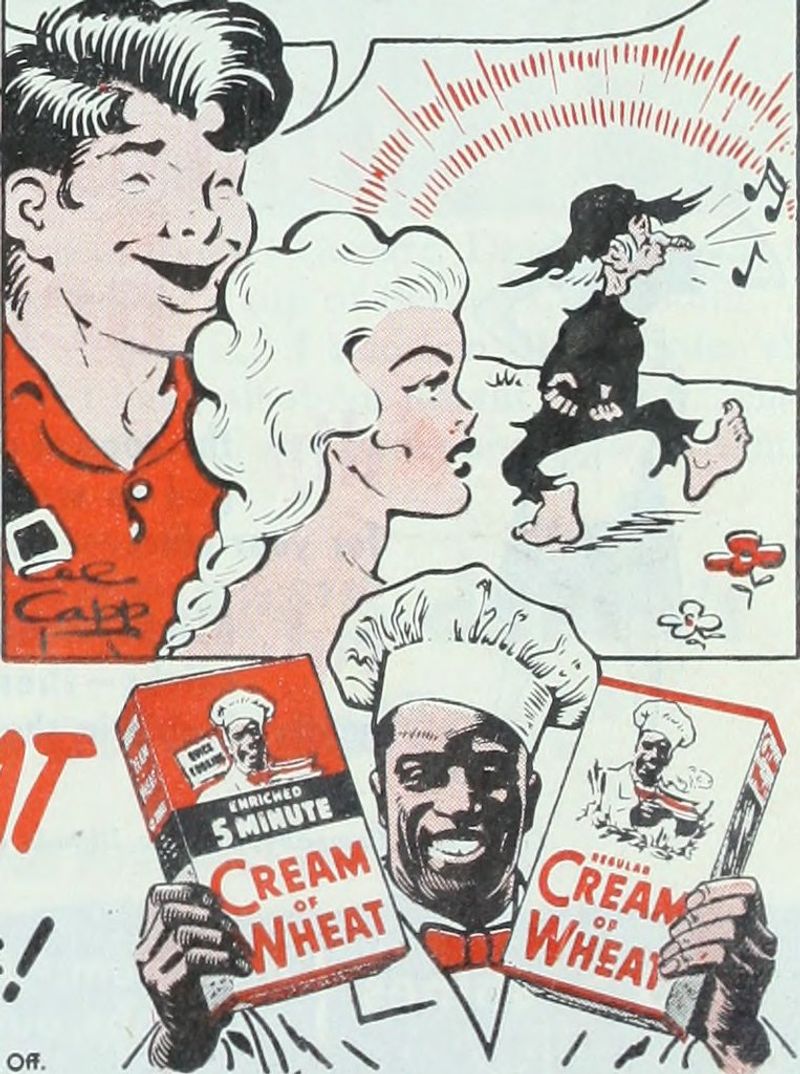
The Cream of Wheat Chef smiled from cereal boxes for generations, becoming as familiar as breakfast itself. Yet the character’s origins tied back to minstrel-era tropes and subservient depictions of Black people. As public scrutiny intensified in 2020, the brand retired the image to align with contemporary values. The update focused on product heritage and culinary warmth without stereotyped visuals. Reactions mixed nostalgia with relief, but the decision cemented a brand reset. Today’s packaging emphasizes wholesome comfort and cooking traditions. The chef’s exit demonstrates how long-standing icons can shift from comforting to contentious as cultural awareness grows.
8. Chiquita Banana Lady / Miss Chiquita

Inspired by Carmen Miranda, Miss Chiquita danced through mid-century ads in fruit-bedecked hats and cheerful jingles. She humanized bananas with a glamorous wink, shaping brand identity at a time when animated spokes-figures thrived. Over time, the company streamlined visuals, leaning on the blue seal and product quality. The flamboyant mascot faded from heavy use as tastes shifted from theatrical to minimal. Occasional nods persist, but not as a core driver. Her decline reflects branding’s move toward simplicity and authenticity. Miss Chiquita’s legacy remains a colorful chapter in produce marketing history, even as modern campaigns favor cleaner, quieter cues.
9. Original Burger King King

Before the surreal, big-head figure, Burger King featured a cheerful, cartoonish monarch in sixties and seventies ads. He embodied family-friendly fast food and kid-focused promotions. As branding modernized, the old king ceded space to new identities and bolder campaigns. The earlier iteration quietly disappeared while the later, edgier King grabbed headlines. That shift mirrored changing tastes from wholesome jingles to viral shock value. The original king’s exit was less scandal than strategy, a clean slate for reinvention. His legacy lingers in retro memorabilia and advertising archives that chart fast-food branding’s rapid evolution across decades.
10. Little Sprout (Green Giant)
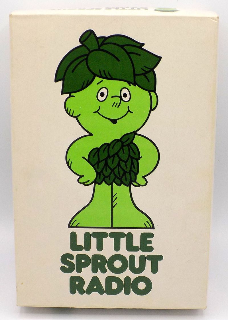
Little Sprout scampered through commercials as the eager apprentice to the towering Jolly Green Giant. He gave vegetables a friendly, childlike voice that soothed picky eaters and charmed parents. Over time, as health messaging and product lines diversified, the brand reduced reliance on character-driven narratives. Little Sprout quietly faded from center stage, appearing only sparingly. The pivot favored clean packaging, recipe content, and wellness positioning. While fans remember his tiny green enthusiasm, modern campaigns prioritize ingredient credibility. Little Sprout’s retreat shows how legacy mascots can recede as brands chase authenticity and nutritional storytelling over whimsical sidekicks.
11. Frito Bandito (Fritos)

The Frito Bandito debuted in the late sixties with a caricatured outlaw persona and sing-song jingle. Almost immediately, Mexican American advocacy groups protested its stereotypical portrayal. Ad revisions softened features, but criticism persisted. By 1971, the mascot was scrapped as the brand pursued less offensive concepts. His swift rise and fall illustrate growing media accountability and consumer activism’s power. The campaign now serves as a cautionary tale in advertising curricula. Fritos moved on to more neutral themes, while the Bandito became a symbol of what not to revive. Cultural sensitivity, once optional, is now mission-critical for brands.
12. California Raisins

Born from stop-motion brilliance, the California Raisins sang Motown hits in clay, dancing into merchandise, TV specials, and lunchboxes. Their pop-culture blitz defined late eighties ad creativity. But production costs were steep, licensing complex, and novelty fleeting. As returns diminished, the campaign dried up. Attempts to revive them never matched the original magic. The Raisins’ disappearance underscores how high-concept mascots can flame out without sustainable economics. Still, their silhouettes remain iconic in advertising lore. They proved commercials could be cultural events, but also warned that virality without longevity can wither on the vine when budgets and trends shift.
13. Kool-Aid Man’s Extreme Era
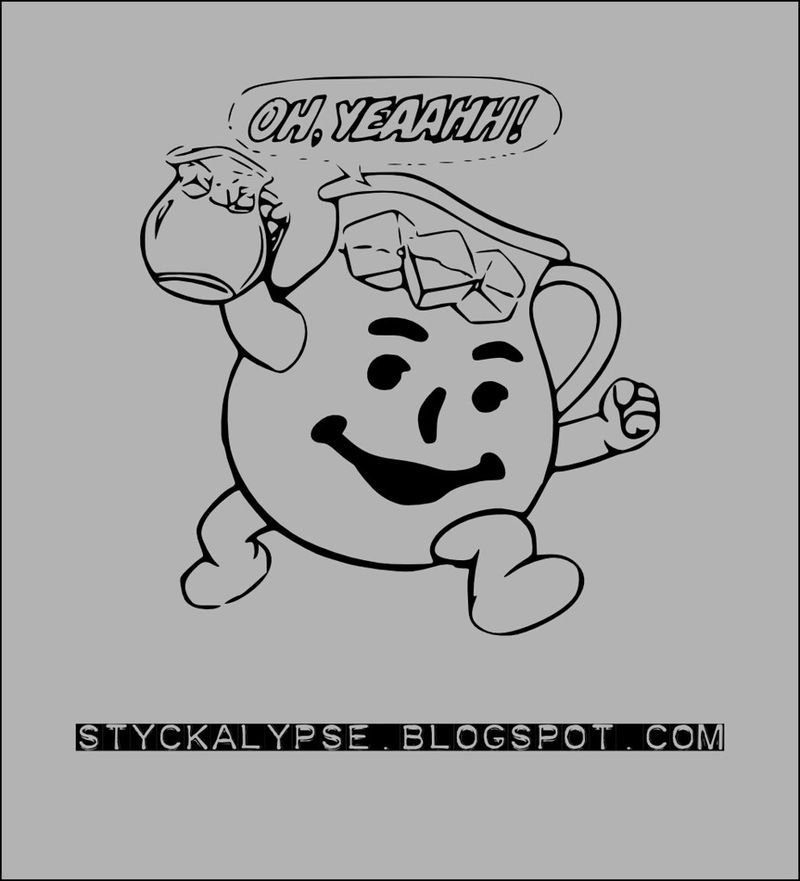
Kool-Aid Man once burst through walls with gleeful chaos, then pivoted into an extreme nineties vibe with louder colors and wilder antics. As parents scrutinized sugar and brands chased wellness cues, the over-the-top persona cooled. While Kool-Aid Man never fully vanished, the extreme era’s tone receded quietly. Newer spots softened smash-through gags and focused on flavor variety and occasions. The character’s loudest version effectively disappeared, replaced by gentler, meme-ready cameos. It’s a reminder that mascots can evolve by subtraction, shedding a noisy skin to fit changing health narratives and marketing channels without total retirement.
14. Mr. Six (Six Flags)

Mr. Six, the spry old man in a tux, became synonymous with Vengaboys-fueled theme park hype. His dancing bus arrivals promised instant fun and cheap thrills. Despite strong recognition, brand leadership shifted focus to safety, families, and ride innovation. The quirky mascot didn’t fit the refined narrative and was retired, briefly revived, then retired again. As social media reshaped fandom, parks relied on ride POVs and influencer content instead of costumed spokespeople. Mr. Six’s disappearance shows how entertainment brands recalibrate tone. The energy remains, but the face changed from campy character to immersive experiences and shareable moments.